
When you start designing a website, you’ll have to know the differences from mobile-friendly vs. responsive vs. mobile-optimized. So what do they mean and which do you pick? Even these terms that are used very frequently by web designers and web developers can be misunderstood.
That’s because they are used interchangeably and somewhat loosely. Many people, and even many experienced web designers, will use these terms to mean a website that also works and looks good on a smartphone or tablet. As more users spend time on all types of screens, more and more websites make a strategic effort to adapt to various screen sizes. Any websites that doesn’t could risk falling drastically behind their competitors.
 Illustration by OrangeCrush
But not to worry, in this article we’ll go over mobile-friendly, mobile-optimized, and responsive design approaches, provide some top principles to keep in mind and show examples of websites that do it well. All of which will help you make a strategic and well-informed decision for your website.
The difference at a glance
If you are new to the subject of web design, you probably have a number of questions about how websites are designed to look visually appealing on both desktops and mobile devices. But from desktop to mobile there is a range of what your website could look like.
 Web and mobile design by His-P Design Studio
Mobile-friendly, mobile-optimized and responsive design are approaches to web design that aim to make websites usable and viewable on various devices. For a quick reference guide, here are the terms in a nutshell:
- Mobile-friendly is to adapt a website that has been designed specifically for desktop screens to a smaller version for smartphones or tablets. This is usually the bare minimum of mobile design that most businesses can get away with. Though this might seem like an easy and cost-effective solution, plenty of websites aren’t successful unless they follow mobile-friendly design tips.
- Mobile-optimized, though it sounds similar, is actually a far more advanced and complex design technique than mobile-friendly. A mobile-optimized website isn’t simply a smaller version of a desktop site, nor is it as simple as images resized for a smaller screen. It is a website that is completely designed for smartphone use.
- Responsive websites are able to respond to the device they are being viewed on, and will automatically reformat themselves so that they work well and look great on laptops, tablets, smartphones and almost any other device. This is the ultimate adaptive web design.
 Web and mobile design by rylian
Whether you decide on mobile-friendly, mobile-optimized or responsive web design, your website can still look great as long as you know what to keep in mind. Lucky for you, we have an in-depth look into mobile-friendly, mobile-optimized or responsive web design and how to do it well.
What is mobile-friendly web design?
Mobile-friendly web design is often a slimmed down version of the desktop. It’s an approach to web design that makes small tweaks to a desktop-oriented website so that it can be used on smartphones as well.
Taking this approach means that web designers need to keep in mind a few key principles:
- All fonts used on your site should be at least 14pt or 16pt. This is pretty standard size on a laptop screen, but anything smaller is hard to read on a smartphone.
- Images should be re-formatted so that they are small enough to load quickly on a smartphone, over a mobile internet connection.
- Certain effects, particularly the mouse-over effect that is so common on desktop sites, cannot be used with smartphones, and should be avoided.
- The elements of a page should be carefully designed and arranged so that they don’t overlap each other when the page is shrunk down to the size of a smartphone. Instead the elements could be stacked on top of each other using a carousel with horizontal scroll, like for testimonials or images.
 Mobile-friendly web design by akorn.creative
In practice, designing mobile-friendly web pages can be tricky, especially if a website already exists in a desktop version, but there are tips for mobile-friendly web design that can help. Often times reducing and consolidating information from a desktop version to mobile version is a process of compromise: what is the key information readers need to see? What information can you stack in a carousel?
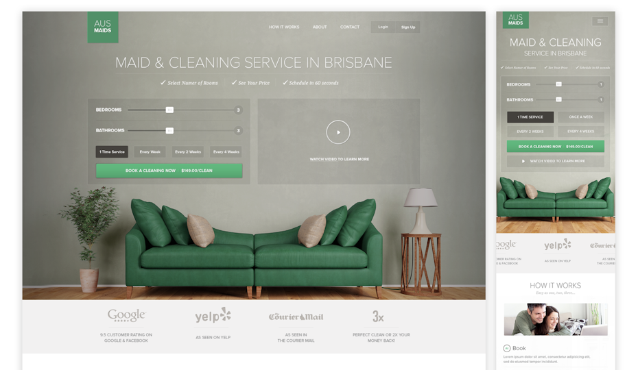
 Mobile-friendly web design by A.D.S
The mobile-friendly web design by A.D.S uses collapsible/ expandable sections to hide information unless the user wants to view it. By placing the key information first, users will be able to navigate through the rest of the site with no problems and can expand or collapse sections as they need.
What is mobile-optimized web design?
Mobile-optimized web design is a website that is designed with mobile users in mind first. This means starting at the smallest screen size, like for smartphones, and expanding to larger screens like for desktop. This is the opposite approach to mobile-friendly web design, where the goal is to take the large version and condense it into a smaller size.
 Mobile design by Andrew Grzesiak
When people access your website on their phone, you want users to be able to find what they need quickly, whether that’s locating a product or finding an answer. On top of that, mobile-optimized websites want to simplify the website by compressing images, shortening copy and limiting text fields. They tend to avoid any animations, mouse-over effects and pop-ups.
Some key principles of mobile-optimized web design are:
- A layout using single columns
- Little need for typing
- Graphics that utilize white space borders
- Simple navigation
- Reduced features overall in order to reduce clutter
You would think given that mobile versions of websites are more minimal than desktop versions they would be easier to design. But in fact, the opposite is the case. Compressing your products or services into a tiny, easy-to-use design can be very challenging.
 Mobile design by Newwen
Newwen’s approach to this website is to keep it simple. The home page itself is straight to the point with minimal text. Whichever version this website is being viewed on won’t affect its great design or functionality of the website.
What is responsive web design?
Responsive design is a website design that will adapt and accommodate multiple screen sizes. You should be able to adjust the browser width from the widest to the thinnest to see the website adapt to the different sizes.
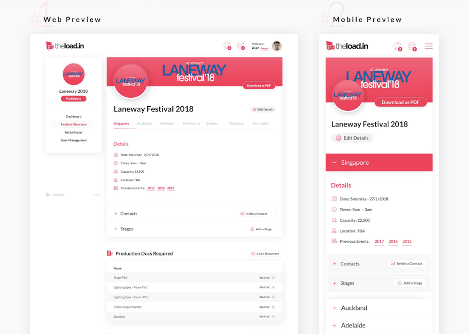
 Responsive website design by MVB
Responsive designs are able to adapt to a huge variety of different devices and contexts—everything from smartphones to widescreen 4K monitors. This is what responsive design aims to achieve. Because of its adaptability and responsive nature, this approach to web design is often the most complicated and costly.
If you are thinking of a responsive web design, these are some key principles:
- Multiple breakpoints for web design—this means creating a design for each point where your website’s layout will change. This defines how your website will be responsive and where the elements will move at each breakpoint.
- Fluidity—when screens get smaller on responsive designs text will take up more vertical space, and everything else gets pushed down. This means designing for fluidity and movement by ensuring each element can move into a new place without compromising its quality.
- No desktop- or mobile-first approach—it doesn’t matter if your users are primarily desktop or mobile, responsive designs will adapt to all screens. So ensuring functionality and design works on a large screen is as important as a small screen.
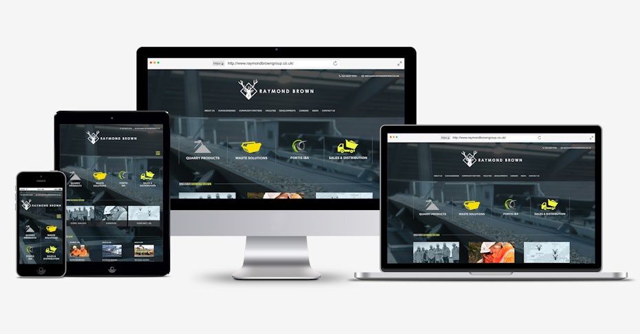
 Responsive web design by Technology Wisdom
In Technology Wisdom’s design, you can see how the three versions maintain the same design elements and structure. Effective responsive design is more about how and where the elements move at each screen size.
Which is best: mobile-friendly, mobile-optimized or responsive?
At this point, you might be wondering where all this is leading, and you might want a clear answer to a simple question: which of these design approaches is better? Should my web design be mobile-friendly or responsive or mobile-optimized?
Well, unfortunately, this is a question without a simple answer. Or rather, the answer is it depends on your needs, business and, quite frankly, budget. Now that you know what mobile-friendly, mobile-optimized and responsive design have to offer, you can consider which will be best for your needs.
No matter what you decide there is a solution to making your website look great and work well, even if you need a professional designer to lend a hand.